Observations from Sorbet's conversations with Vice President of the Pantone Color Institute, Laurie Pressman.
Our color forecasters are designers with different areas of specialties, and they’re based around the world. They’re anthropological by nature, because they’re always looking around. They’re looking at all the areas that could influence trends in color. Color is a language, so if you look at global trends, macro trends,micro trends, and color trends evolve from that, because color is reflecting what’s taking place in the culture. So if we see, let’s say, nature becoming more important, what does that mean for color? If we see a society that’s shifting from ownership to sharing, what does that mean for color?

Is sex not power? It’s how you present the Melanie Griffith versus the Kelly Lebrock. How does power present itself? If someone can walk into a room and command everybody’s attention by making a dramatic statement, an intentionally sexual statement or otherwise, isn’t that power?
The psychology of color is both fixed and fluid. If you go back to the origins of red, it’s fire and blood.
So our immediate responses to things like that almost become imprinted in our subconscious, and we react accordingly. On the other hand, there are things that are less fixed. If we go back through our consumer color-preference studies from years ago, and we started talking to people about certain kinds of brown, their reactions would have been ‘dirt’ and ‘earth’. Today they may look at those browns and say ‘a cappuccino’; they may say ‘chocolate fudge’, they may say ‘a macchiato’ because we’ve got such a coffee- and chocolate-oriented culture that we could almost call it ‘The Starbucks Phenomenon’.

If you go back to the eighties, and you look at what women could wear in the workplace, it was the navy suit, the gray suit, the black suit – all with the padded shoulders. I always think of Melanie Griffith and ‘working girl’ probably representing the best example of what women were wearing to work. Or the movie, ‘The Woman in Red’ – one of Genewilder’s love interests wears a navy-blue suit to work, and the other, Kelly Lebrock, wears a red dress – there it’s portrayed as more sexual than professionally powerful.

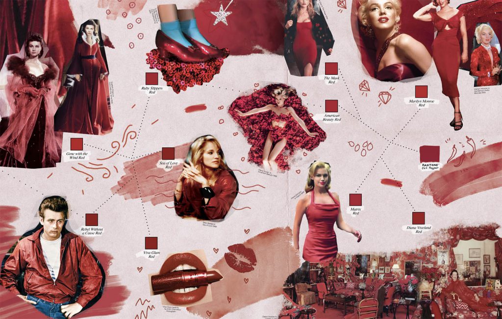
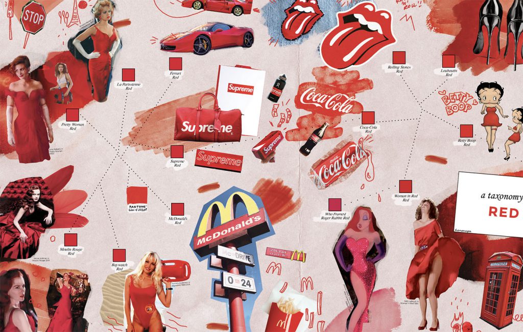
Politically, since the republican victory – red, right? – you’ve seen so much red on the runways; the shoes, pants, jackets, dresses, lips and everything were red. The handmaid’s tale was interpreted on the runway too. This was all about power, about women asserting themselves – red is now about empowerment, it’s a second power color to black; it’s confidence; it’s being bold.
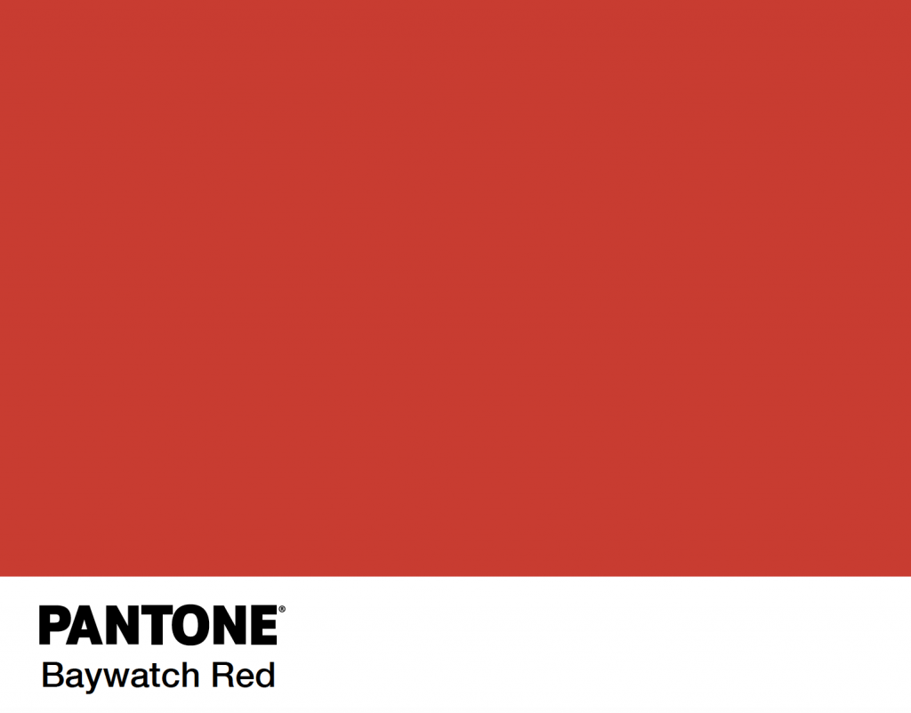
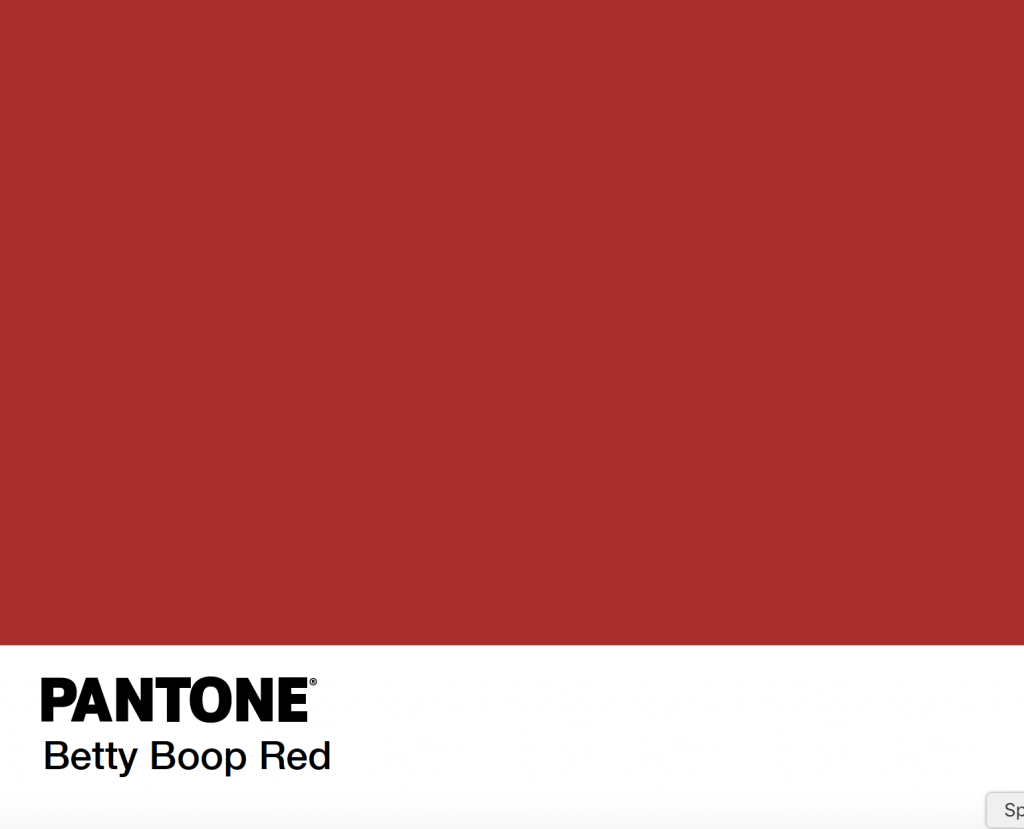
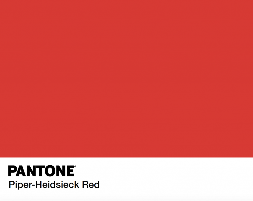
Just look at the diversity of red – we recently worked on Betty Boop red. They approached us because they wanted to revitalize their red, they wanted to appeal to a new audience. We just did Baywatch red. We worked with Piper- Heidsieck on its red, and we’ve just finished working on rolling stones’ red – it’s done, but it’s not released yet. And Cartier; we’re working on Cartier’s red, but that’s not released yet. Last year we did a piece for Coca-Cola on a lot of different stories centered on red. And I remember thinking, it’s really the color of energy, and the color of strength at a time

