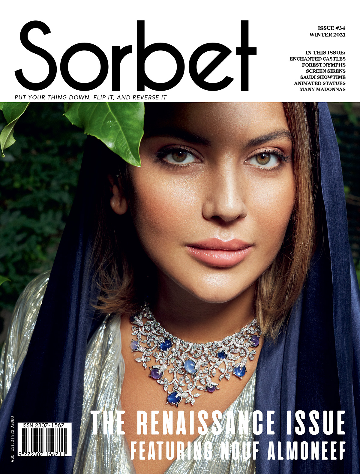
MARIKO MORI AND BVLGARI TALK COLOR WITH BVLGARI KALEIDOS IN TOKYO
Written By: Ali Y. Khadra and Khansaa Houlbi At Bvlgari, color does
Written By: Ali Y. Khadra and Khansaa Houlbi
At Bvlgari, color does more than catch the eye. It shapes meaning, memory, and identity, a philosophy fully realized in its latest exhibition, Bvlgari Kaleidoscope: Colors, Cultures, and Craft.
Color has a way of leading the conversation. Sometimes it defines a design, sometimes an entire mood, and occasionally, a whole issue. Case in point: Sorbet’s Red Rhapsody. A single shade can trigger a rush of feeling before a word is ever spoken. And few houses understand that power quite like Bvlgari.
Courtesy of Bvlgari
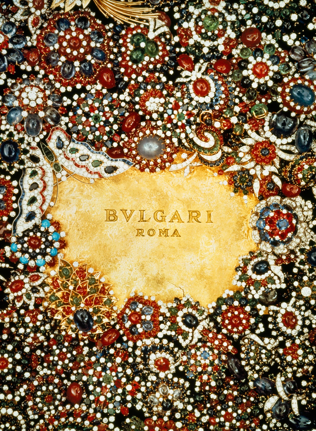
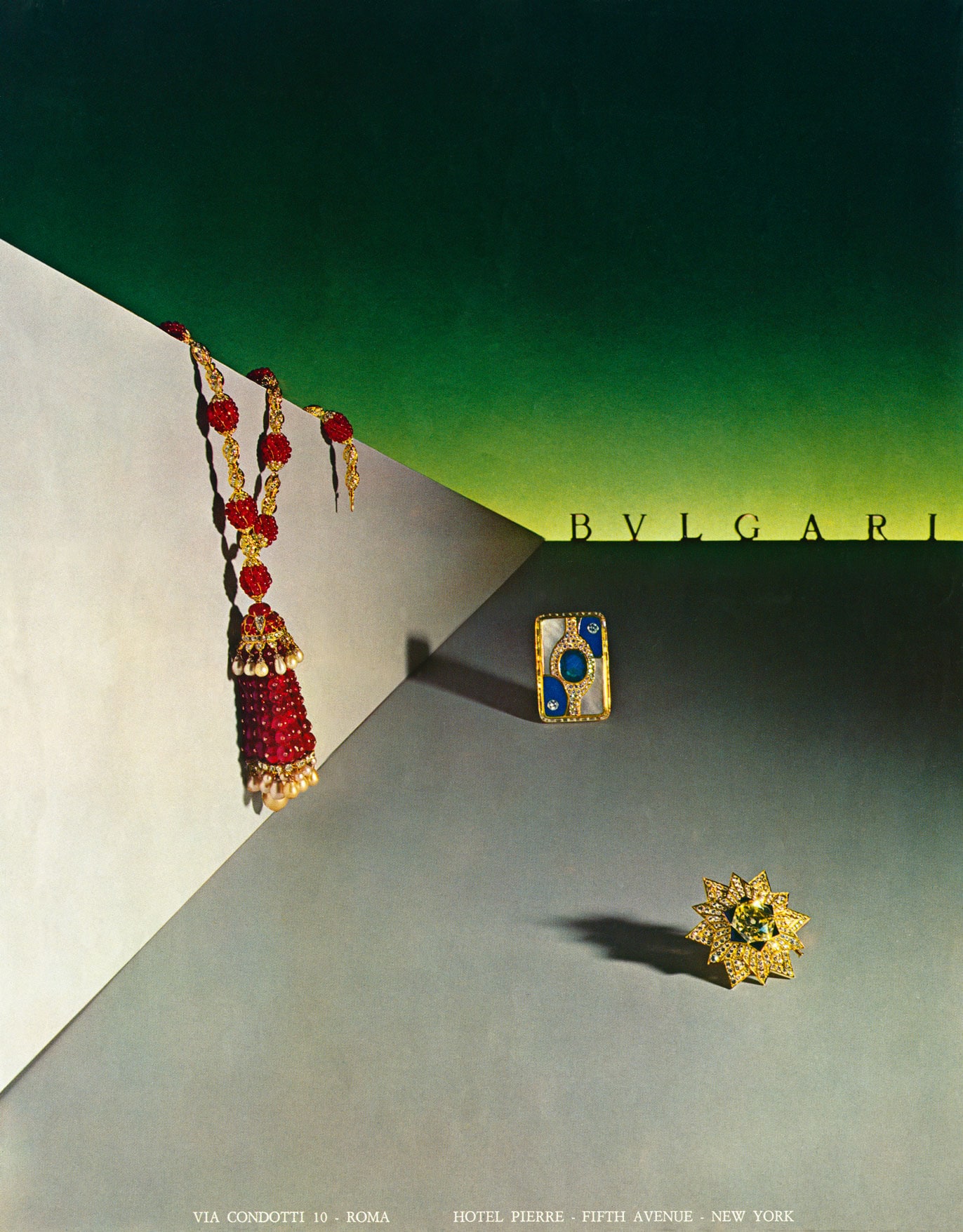
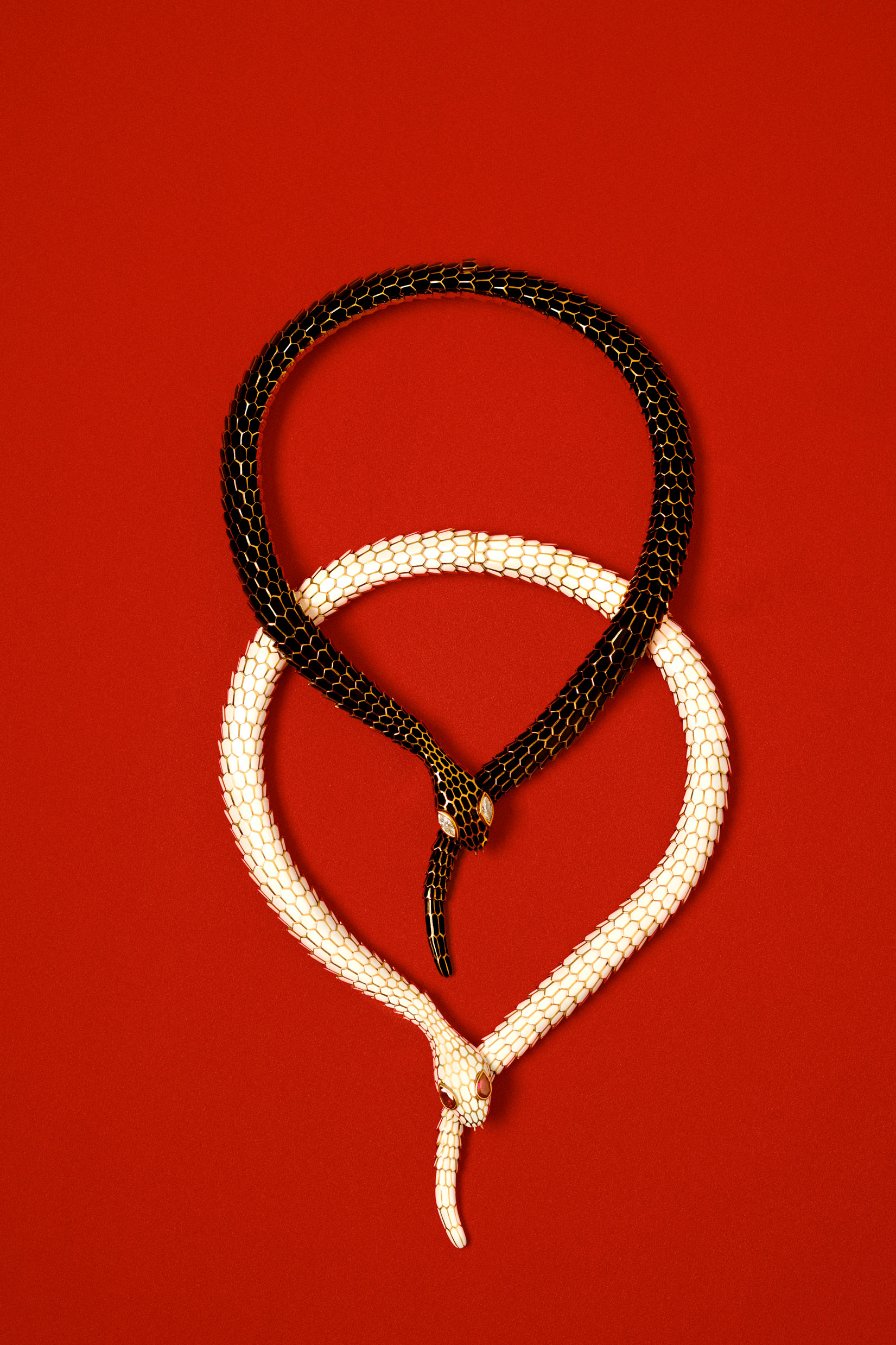
Over the years, Bvlgari has turned color into a language of its own, presenting it through ever-evolving perspectives and extraordinary creations. From vivid gemstones to daring combinations, the Maison has consistently shown that color is not an accent, but a statement. Just last summer, we explored this philosophy through Bvlgari’s high jewelry exhibition, Polychroma. Now, we encounter the House’s chromatic vision once again, this time through Bvlgari Kaleidos: Colors, Cultures, and Crafts, an exhibition devoted entirely to color in all its brilliance.
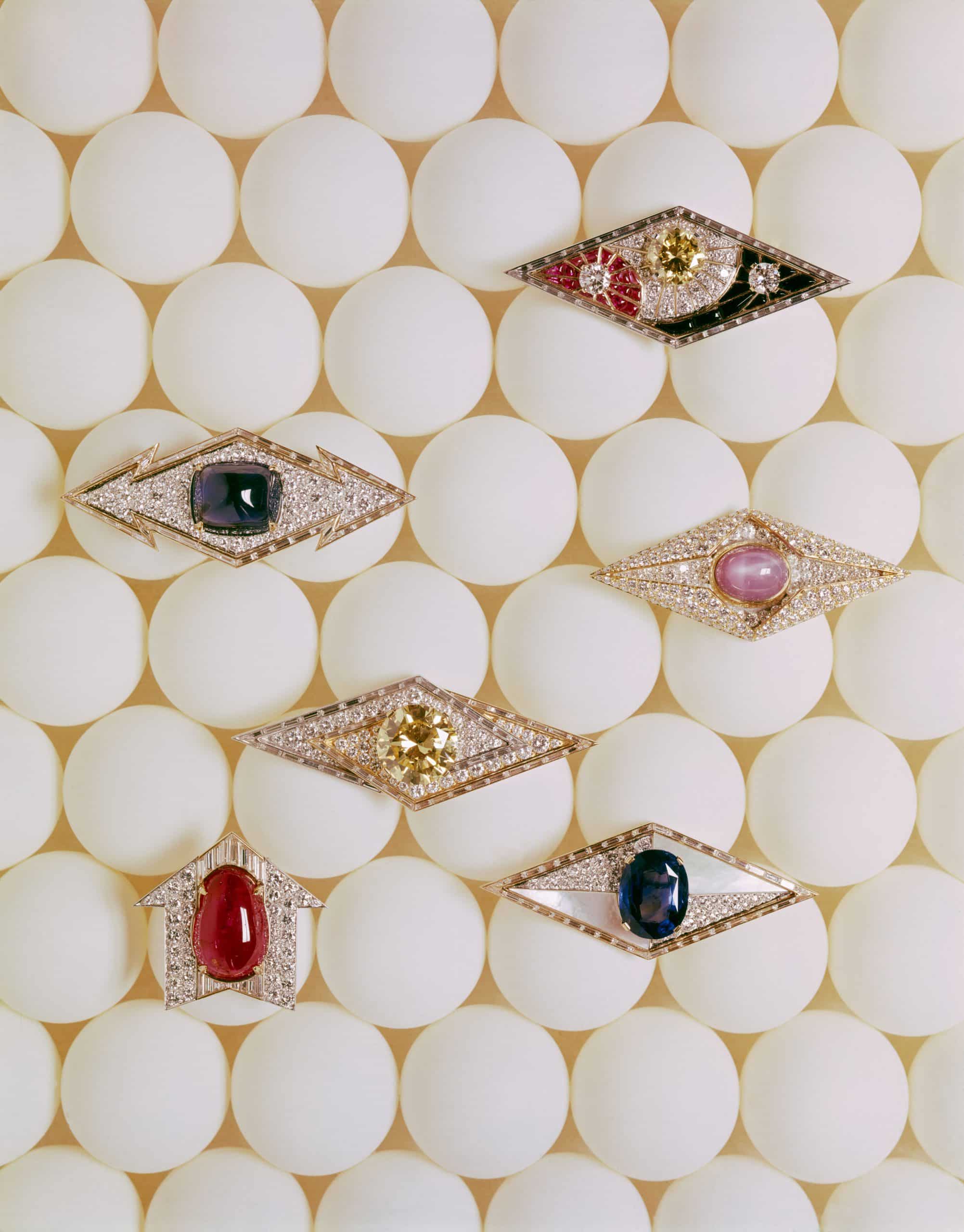
True to its name, Kaleidos unfolds as a vivid exploration of color in constant motion. The exhibition brings together nearly 350 chromatic treasures from the Bvlgari Heritage Collection, as well as private and novelty pieces, revealing color as both a creative tool and a defining language of the Maison. Here, color is not decoration but structure, emotion, and identity all at once.
The exhibition unfolds across three distinct sections and is further enriched by contributions from three contemporary female artists, each offering a personal interpretation of what color means to them. The result is a dialogue that moves seamlessly between jewelry, art, and emotion, reinforcing Bvlgari’s belief that color is both deeply personal and endlessly expressive.
To mark this vibrant moment, we sit down with Laura Burdese, Bvlgari’s deputy CEO, alongside exhibiting artist Mariko Mori, to discuss the role of color in shaping creativity, identity, and the enduring allure of the Maison’s chromatic world.
Courtesy of Bvlgari
Courtesy of Bvlgari
ALI Y. KHADRA: The exhibition feels monumental in scope. How long was it in development, and what were the key challenges in bringing it from concept to reality – particularly in choosing Japan as its setting?
LAURA BURDESE: It took almost three years. I joined Bvlgari in 2022, and very early on I started saying that we should organize an exhibition. We were coming out of Covid, and for a few years we had all stopped doing this kind of retrospective exhibition. I said to the team, we have to restart and think about a monumental, beautiful exhibition of our fantastic heritage collection.
In the meantime, we were also acquiring new pieces, so the collection was expanding and becoming even more relevant. We started the project three years ago, and then we decided to come to Japan – for several reasons, but also because we knew that this year Japan would host the International Expo in Osaka.
We felt that, for this reason, the exhibition could reach many more people and a wider audience, which is also very much our goal. It happened exactly 10 years after the last exhibition, so it felt like a perfect alignment of the stars.
Working in Japan is a real pleasure. The teams here are extremely structured and disciplined, and they share with us the same love for precision, the same obsession with detail, excellence, and uncompromised quality.
Even Gislain, our curator, and the Japanese curator – they connected very well right from the beginning.
We involved CGM and SANAA Studio very early on. They had already worked with us on watches in the past – [SANAA co-founder and architect Kazuyo] Sejima designed a couple of Finissimo watches – so we knew each other. It felt very natural.
Sejima already knew and loved the brand, and she immediately understood that we wanted to design a space that would magnify the jewelry, creating an experience in itself without overwhelming the pieces. Our goal was really to do something never seen before.
Usually, watch and jewelry exhibitions are quite traditional. They’re done chronologically, decade by decade – which I said from the beginning we didn’t want – and they’re often dark, immersive spaces where the spotlight is only on the jewelry.
I said no, we are Bvlgari; we are different. We wanted to express our DNA in another way – fresh and modern – because, in the end, our heritage and our legacy are not a destination. They are a starting point.
So we chose to present our story through the most beautiful 345 pieces we have, but not through time periods. Instead, we told the story through one of the most essential parts of our identity: color.
It was a long journey, but not a difficult one.
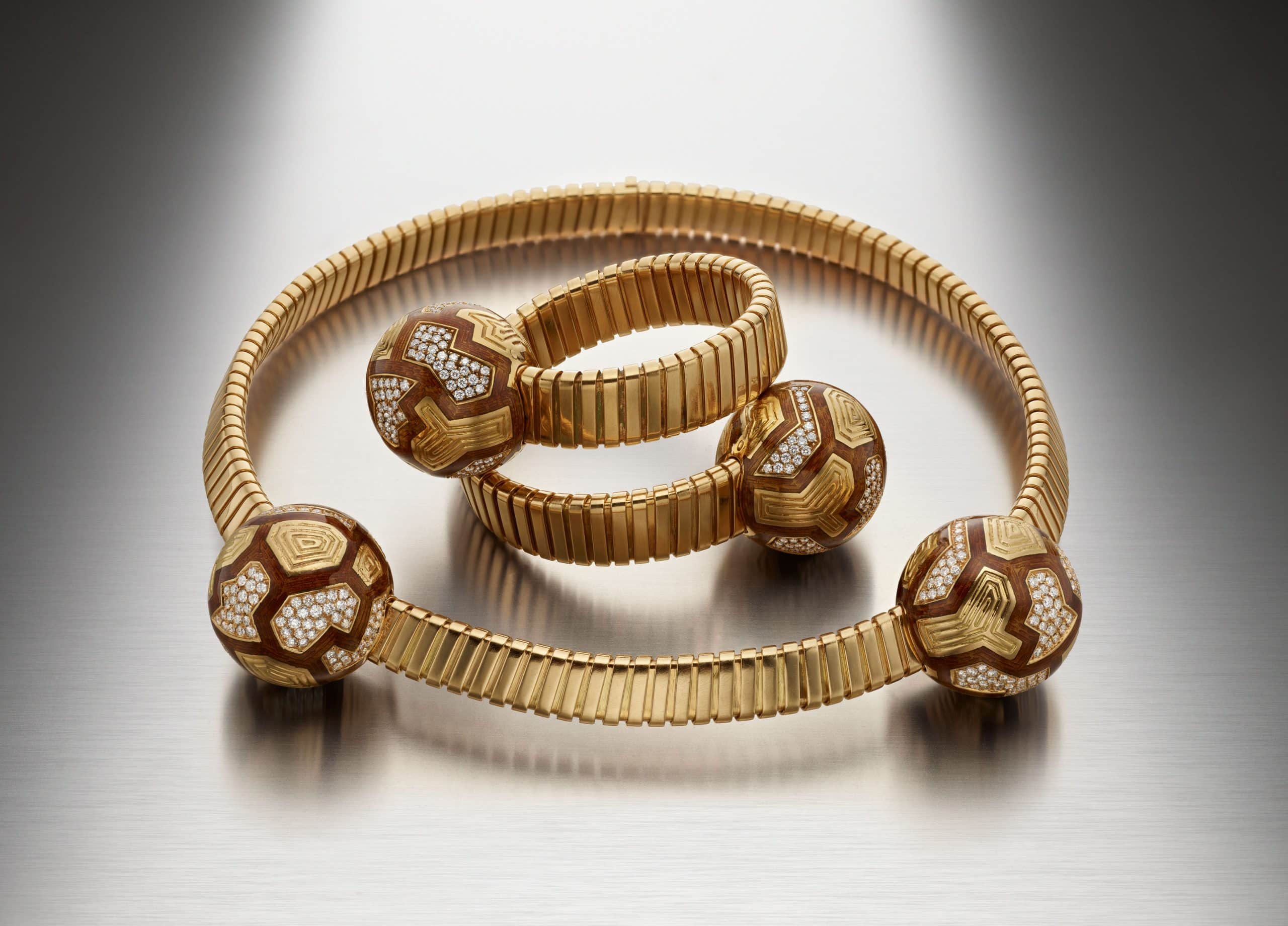
AYK: I loved the stainless-steel and aluminum finish. It felt reminiscent of the past but also the future. And I loved the final section with the silversmith – everything in silver. That was a strong statement. I don’t think I’ve ever seen that in a Bvlgari exhibition. You brought the origins back at the end. What was the intention? Why the monochrome silver, with Tubogas pieces placed almost quietly in the corners? Was this a curatorial decision?
LB: Let me start with the aluminum. When we began working with Sejima on the design and layout, she proposed this idea of leaf-like forms inspired by our Divas motif. When I first saw the design, I immediately loved it and understood it conceptually. But I also told her that I didn’t want visitors to feel enclosed in small rooms.
She reassured me right away that most of the partitions would be glass, and the others steel. The glass would be transparent, and the steel would reflect light and color. This would create a sense of calmness, with rounded forms – especially meaningful in Japan, where roundness is associated with life, well-being, and harmony. She said, “You will see – it will feel spacious, light, and bright, and the pieces will truly be celebrated.”
That’s the role of aluminum in the exhibition: to reflect light, amplify space and color, and give a modern, contemporary feeling.
Courtesy of Bvlgari
Courtesy of Bvlgari
Courtesy of Bvlgari
As for silver, we loved the idea because we wanted to tell the full story – but not in an obvious or chronological way. Introducing metals wasn’t an obvious choice, but for Bvlgari, color and material always go together. There is no color without matter, and no matter without color.
For us, color is never flat or just a reflection of light. Color is physical, three-dimensional, material – a bit rough, like the cabochon-cut stones, where you see inclusions and what we call perfect imperfections. That’s why silver was not only historically relevant for Bvlgari, since it was so important in the beginning, but also conceptually essential: it speaks to this dialogue between color and material.
AYK: It really felt like a final reminder – this is where it all started. You saw all the magic – Monete, Diva – and then you came back to the origins.
Among all the dimensions of this exhibition, which moment are you personally most eager for visitors to experience?
LB: For me, the experience is completely holistic. Each room is designed to evoke a different emotion, so it’s very difficult to isolate just one moment. Color is not simply light; color is emotion.
As you walk through the exhibition, colors change, reflections change, and your emotions change. You feel Bvlgari and you live Bvlgari.
The transitions between the three chapters are marked by three artworks – representing the brain, the heart, and the light. These moments are deliberately disorienting. You walk through rooms filled with color, then suddenly enter a space like the Marfa Barretto installation or Mariko Mori’s work, and you feel as if you’re on another planet. You ask yourself, “Why is Bvlgari doing this?”
This stranamento, as we say in Italian – this feeling of displacement – is intentional. It forces you to reflect on your emotions. You encounter color as movement, as vibration, as contemporary industrial art. Then you return to another section, changed by that experience.
That emotional journey, with its contrasts and transitions, is what matters most to me.
AYK: Bvlgari chairman Jean-Christophe Babin said the mission is not only commercial, but to evolve the art of craftsmanship and jewelry. Do you see this as the beginning of a deeper dialogue with Japanese culture and crafts?
Courtesy of Bvlgari
LB: Absolutely. If you look at our retail spaces, for example, you’ll see artworks created by Italian artists using traditional techniques to interpret Mount Fuji. We always try to integrate cultural elements – in materials, textiles, and products – as a form of respect, homage, and celebration of local cultures.
This approach has always been part of Bvlgari. We’ve collaborated with Japanese artists for decades, even when the Bvlgari family was still directly involved. Cultural openness is one of our core values. We believe magnificence flourishes through diversity, cross-pollination, and openness to the world – while still maintaining a precise, distinctive aesthetic.
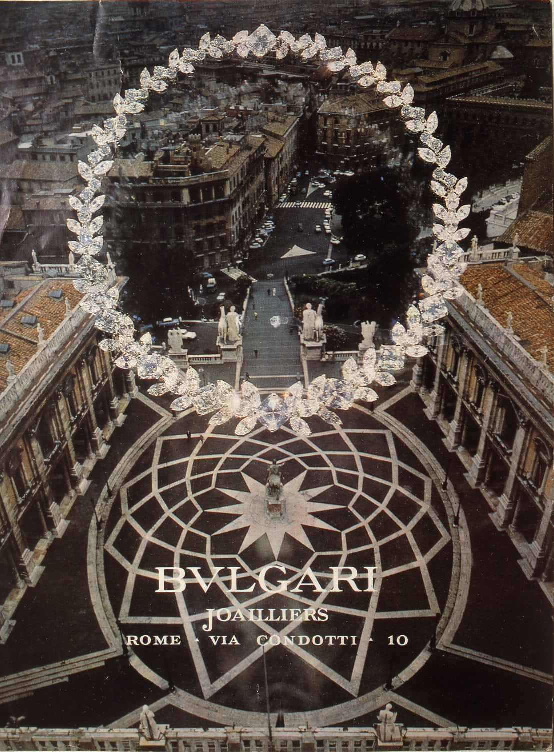
And in the end, that spirit of openness is exactly what Rome represents.
AYK: Can I ask you to name three favorite pieces; I know it’s difficult with 345 pieces…
LB: Actually, it’s not difficult, because I’ve worked on every single detail of this journey.
The first piece is the one we chose for the main visuals: the sautoir from 1969. It perfectly embodies the meaning of the exhibition. It represents the metamorphosis of Bvlgari – it can be worn as one piece or transformed into three bracelets. It’s beautiful from the front and the back, with seven different stones and three different golds. It defines the Bvlgari spirit.
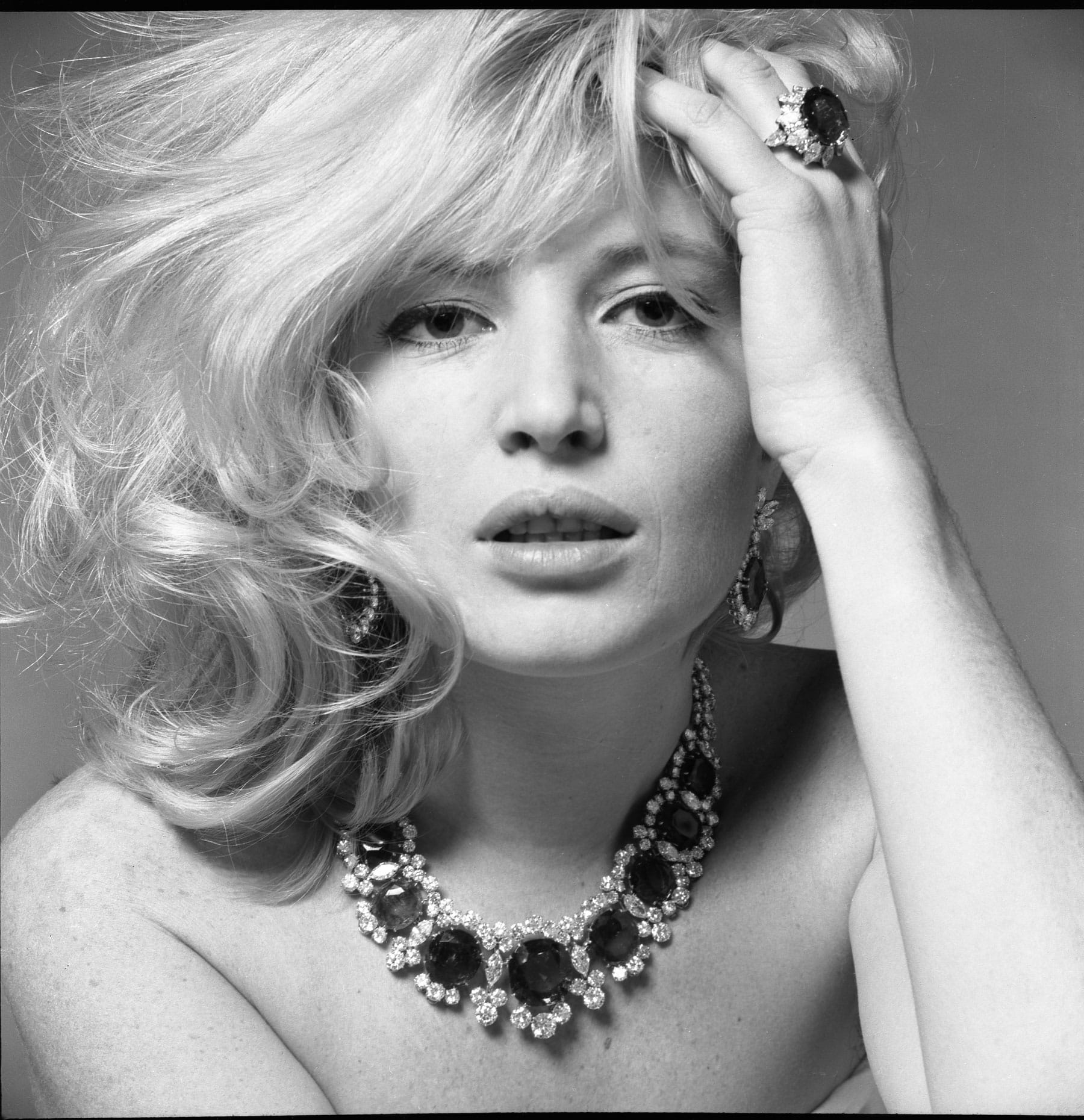
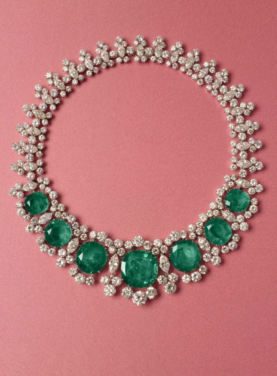
The second is what we call the Seven Wonders collier – the necklace with seven emeralds worn by [late Italian actress] Monica Vitti. We recently acquired it from a private family, and it’s very special to me. The cabochon emerald is such a Bvlgari stone, and the image of her wearing it exists in every store.
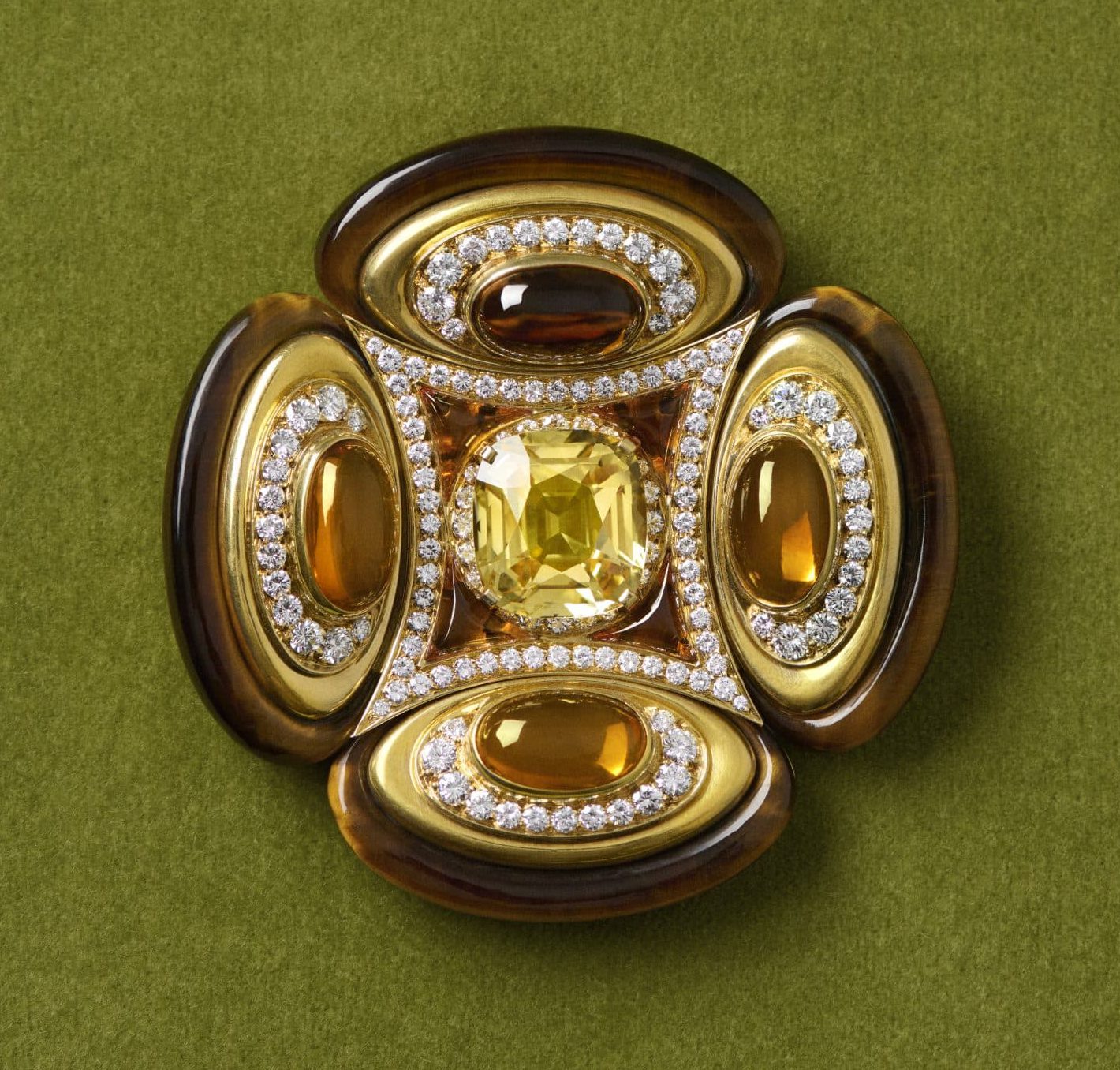
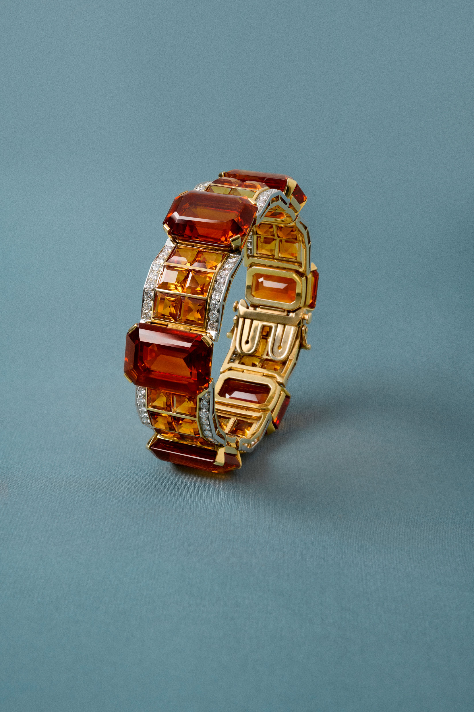
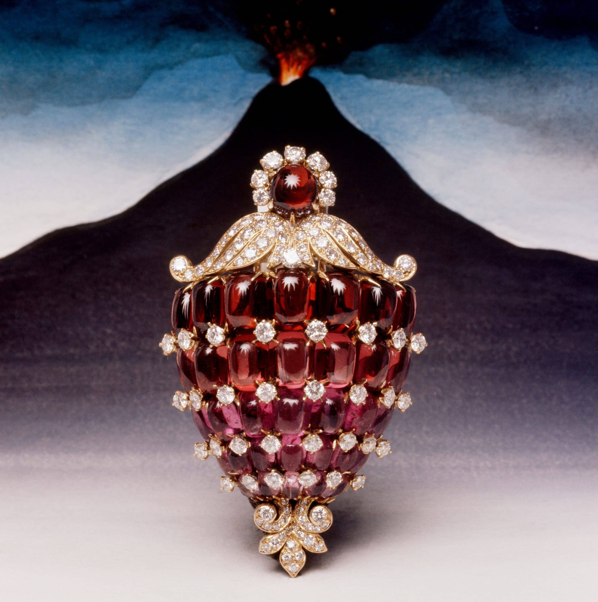
The third is a citrine bracelet from the 1920s that you see at the beginning of the exhibition. Citrine is the color of Rome – the orange sunset of Rome, which we often describe as the Bvlgari color. While Bvlgari is never just one color, if I had to choose one, it would be this.
AYK: The book is magnificent – congratulations. It’s incredibly detailed, even down to the indexes.
LB: Thank you. From the beginning, we were very clear: we didn’t want this exhibition to be commercial. There are no new pieces here. If you want to see those, you go to the boutiques – that’s not the subject.
We also didn’t want a shop within the exhibition. The only things we chose to sell were postcards and posters, simply because people loved them so much.
AYK: Last question – what’s your favorite sorbetto?
LB: I don’t know if this is politically correct, but I’m more of a gelato girl.
AYK: That’s a sin. [Laughs] Which flavor?
LB: Dark Chocolate.
Courtesy of Bvlgari
ALI Y. KHADRA: Your work Onogoro Stone III draws from ancient Japanese mythology. What inspired you to reinterpret this sacred origin story within the context of Bvlgari’s exhibition? You mentioned during the press conference that this is a space where the first wedding took place.
MARIKO MORI: Yes. The story comes from Japanese mythology – the creation myth of Izanagi and Izanami. They are gods, a god and a goddess, who were ordered by higher gods to create Japan.
AYK: Why did you decide to connect this story to the exhibition and to Bvlgari’s history?
MM: In Japan, we have something called iwakura, which means a divine stone – a stone where nature gods descend or sometimes reside. The Onogoro Stone is also considered a divine stone. These stones are usually not colorful or luminous in a physical sense, but spiritually they are very special because of the presence of nature gods.
I wanted to interpret this idea of light and color – almost like seven magical colors – emerging from the stone. I felt there was a shared value with Bvlgari’s history: the excavation of stones and the transformation of raw material through craftsmanship, making stones come alive with beauty and aesthetics. It felt like a privilege to bring this creation myth into the exhibition.
AYK: What is the material of the piece? Is it Plexiglas?
MM: It’s similar to Plexiglas, but I used pure monomer, which gives it an exceptional clarity. It’s much clearer than standard Plexiglas because it’s a pure material before it becomes acrylic. It’s layered, but extremely transparent because of that purity. And it’s produced in Japan.
AYK: Did you infuse color into it, or is the color natural?
MM: I used a darker base sheet and developed a very specific color produced using a nano-integral process – something like a chamber where particles operate at a very small scale. It’s similar to the technology used for lenses. I adapted it for a large-scale work to achieve this effect.
AYK: Did you decide on the number of facets in advance?
MM: Yes. I followed the actual form of the Onogoro Stone. This piece is a direct representation of it. The original stone exists on Tokushima Island.
AYK: Is this a unique piece, or part of an edition?
Courtesy of Bvlgari
MM: It’s unique, with one artist’s proof.
AYK: You often explore themes of spirituality and the cosmos in your practice. How does this work reflect your ongoing exploration of the relationship between humanity, myth, and the universe?
MM: Through my practice, I’ve come to understand – and I’m still researching – that we are all connected, that we are all one. We are embraced, blessed, and here to share and express love. When you have this sensibility, you naturally connect it to the universe – to other planets, to plants, water, stones – everything that exists.
We are very attached to physicality because we see through our eyes, but in reality we are spiritual beings. We don’t always perceive this because we look only through the physical eye. But when you feel that connection, that you are part of a whole, your understanding shifts.
AYK: Have you always been spiritual?
MM: I had a spiritual experience in my twenties. And then, every seven years or so, I’ve had similar moments. Eventually, I came to see the world this way, and I want to share this perspective through my work.
AYK: The exhibition highlights a shared passion for color between jewelry and fine art. How does color function as a force of transformation and perception in your work? Your work often feels pure, transparent, and spiritual – how do you introduce color, especially in this piece?
MM: The dichroic surface technology I use is unpredictable. You can’t fully control it – it depends on how light interacts with the surface. What you perceive as blue is actually green in the material itself. Green’s complementary color is pink, which is why when you look from the opposite side, you see pink.
So the color isn’t fixed. It’s monochromatic, but it changes beautifully depending on light, reflection, and position.
AYK: Your use of futuristic materials creates a sense of ethereal minimalism. How did you approach the dialogue between color, material, and form in Onogoro Stone?
Courtesy of Bvlgari
Courtesy of Bvlgari
MM: I like developing new materials and new methods of making. For me, it’s like creating a new vocabulary. It’s fun, and experimentation is exciting.
AYK: What is your workshop like? If I walked into it, what would I see?
MM: Since Covid, I work remotely. My team is spread across London, Milan, and New York, so most of the time I work alone, researching historical material, philosophy, culture. When ideas become more defined, I reconnect with my team.
It’s a different way of working. I used to be in a studio from 9am to 6pm, like a job. But now I prefer this freedom. Sometimes I research under the sea, sometimes I look at Heian- period calligraphy from the 11th century. There are so many cultural treasures that people overlook. I like to dive deeply into them – that’s what allows ideas to emerge.
AYK: Are all your works made in Japan?
MM: Not all of them. This one is, but many of my works are produced in Italy as well.
AYK: What was the most exciting or challenging aspect of translating your artistic language into the context of a jewelry exhibition? Did you immediately think of this mythology?
MM: Yes, because the exhibition concept is based on color. I felt I could contribute unexpected colors – surprising ones. And because Bvlgari wanted to engage culturally with Japan, sharing a creation myth felt very meaningful.
AYK: What kind of emotional or sensory journey do you hope visitors will experience when they encounter your work?
MM: Throughout history – from ancient Rome to Japan – stones like jade have represented dreams, wishes, wisdom, and natural power. Visitors have just seen many rich colors and stones, but I wanted to suggest that the most beautiful stone is actually yourself – your soul.
I hope this work reminds people of that.
AYK: Beautiful. And last question – what’s your favorite sorbet flavor?
MM: Lemon.
Courtesy of Bvlgari
Courtesy of Bvlgari
Related Fashion