A red sky at night is the sailor’s delight, but a red tide delights no one. A red door in China is considered auspicious, but the red planet is ruled by the God of War. How is it that the color red can hold so much meaning for so many societies? Is it because red represents all the human vitals, both physiological and experiential? Clearly, there is something fundamental, something unique to the longest perceivable wavelength on our visible spectrum. In ancient times red and violet — the color with the shortest wavelength — were cousins under the moniker ‘purple’. What a royal family they made, red and violet, what with all their lovely kin (see: scarlet, carmine, incarnadine, and cerise). No wonder it is tempting to write about red by waxing a little purple; it would be treasonous to desaturate a topic so vivid. Embrace the blush! Bask in the glow of its therapeutic hue! If necessary, assign it a district unto itself, but shun it not. Red is the color of life.

MONA HATOUM: HOT SPOT (2006)
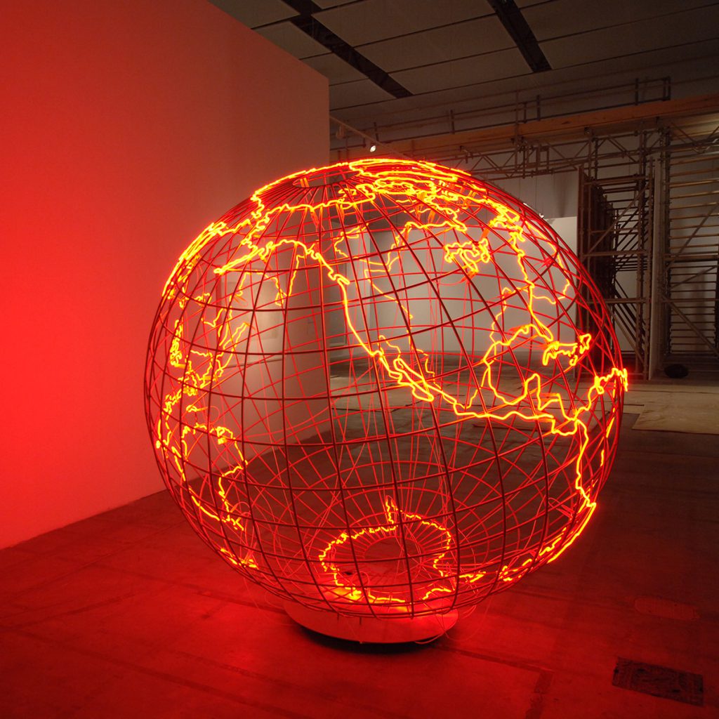
Mona Hatoum’s sculpture Hot Spot (2006), and its various later versions, is as much a sight to behold as it is a sound to be heard. Photographs cannot convey the noise it makes; one must imagine the feverish buzz that is neon’s telltale song. Hatoum’s version of the globe, with the continents traced in glowing red, is a symbol of current affairs — pun intended. Therefore, it is timeless, which also means it is timely: the planet, in the past as now (although it seems especially now), is overcome with strife. This is a sad summation, indeed.
And in light of the increasingly urgent issues of climate change, and the ever louder conversation surrounding them, Hot Spot has taken on (or been laden with, depending on whom you ask) poignant, if obvious, references to global warming. The attempt to raise awareness of this dire situation through art is noble (insert neon gas pun), even necessary, but perhaps the sincerest ecological act inspired by Hot Spot would be to simply unplug it.
ROBERT INDIANA: LOVE (1965), LOVE (1966), LOVE (1967), GENERAL IDEA: AIDS (1987)
Oh, Robert Indiana. For someone who had so much love to give — his most notable works are surprisingly sentimental — he didn’t get much back. A major figure in 20th century American art, Indiana rubbed shoulders with the likes of Andy Warhol, Ellsworth Kelly, and other cultural elites of the post-war New York scene. His word and symbol pieces from the late 1950s and early 1960s put him at the leading edge of the burgeoning Pop Art movement.
But it was his LOVE artworks that skyrocketed him to great, if limiting, fame. Once a Christmas card commissioned by MoMA in 1965, LOVE proliferated in many, varied forms as paintings and sculptures throughout the 1960s and beyond. But the early red, green, and blue version (which eventually found its way onto a postage stamp) is the most enduring. In the late 1980s, the Canadian artist collective General Idea co-opted the RGB LOVE, and turned it on its head. They designed a version that read “AIDS.” The sharp contrast of the red letters popping off the cool background evoked the sharp contrast between what love could mean in the 1960s versus what it could mean a generation later.
LUCIO FONTANA: THE RED PAINTINGS FROM HIS SERIES I TAGLI – SLASHES (1958–1968)
The slash says it all: brave new world. At least that is the promise Lucio Fontana — the Argentinian-Italian artist famous for rupturing the sacrosanct surface of the Modernist canvas — believed it held. Holes of any shape and size represented for Fontana not a violation, but the infinite possibility of the void that lies just beyond the scrim of superficial consciousness. A participant in World War I and a witness to World War II, Fontana, like many 20th century
GettyImages-153427006v2-1024x683
artists, was both enthralled and disenchanted by utopian progress. He looked to art, which he believed was pure philosophy, for a means of advancing the human condition. Light, space, and movement were his greatest concerns. He believed they were fundamental to existence and key to understanding it on a metaphysical register. They informed his grandest concepts, such as Spazialismo (Spacialism), the art movement he founded in 1947. But knowledge, especially higher knowledge, slices two ways (once you know something you cannot unknow something) and birthing concepts anew inevitably brings with it pain — another fundamental truth. Maybe this is why Fontana’s paintings, like Concetto Spaziale, Attese (1960) and the other red examples from his I Tagli – Slashes series (1958–1968), elicit physical discomfort: they bear the topography of wounds. The rewards of pure philosophy cut deep.
ANISH KAPOOR:
MY RED HOMELAND (2003), PAST PRESENT FUTURE (2006), SHOOTING INTO THE CORNER (2008/2009) AND RECENT PAINTINGS

Before Anish Kapoor pissed off every MFA recipient in the world with his “blackest black” monopoly (which is by now a controversy duller than the taupest taupe), he was packing his sculptures so full of pigments that it is difficult to believe he didn’t succumb to a technicolor version of coal workers’ pneumoconiosis.

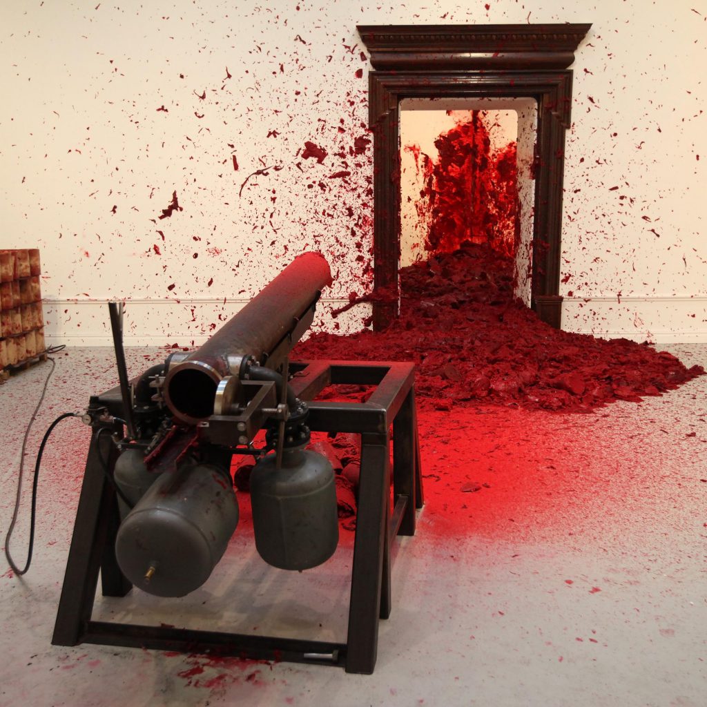
In the early 2000s, he favored the primaries yellow, blue, and especially red. Works like My Red Homeland (2003) and Past Present Future (2006), both made of wax, oil-based paint, and basic mechanical features, are monumental testaments to his interest in the color, which he personally associates with the essence of his childhood as well as more universal interests like genitals and “interiors”. Shooting into the Corner (2008/2009), in which an attendant operates a cannon that blasts chunks of red wax onto a wall, explores other metaphorical associations of red through simple spectacle. It parodies artillery fire, execution by firing squad, and red-blooded male sexuality. But Kapoor doesn’t restrict himself to the male experience. In a summer 2019 solo show at Lisson Gallery in London, he exhibited a series of paintings with titles such as Dirt and Out of Me (both 2018) that look like bleeding orifices. With them, he seems to have explored a rather menstrual aesthetic. Whether he painted the vulviest vulva, however, is a debate for another occasion.
ANA MENDIETA: SILUETA SANGRIENTA (1975) (AND OTHER WORKS FROM THE SILUETA SERIES THAT ARE PREDOMINANTLY RED)
Ana Mendieta wasn’t afraid of a little blood. Nor was she afraid to make something bleed. Born in Cuba but exiled to the United States at twelve due to her father’s anti-Castro activities, Mendieta came of age when land, performance, and conceptual art movements, as well as second-wave feminism, prevailed in the Western cultural ethos. They were important influences for her, though she would never align herself to any single movement or categorical practice.
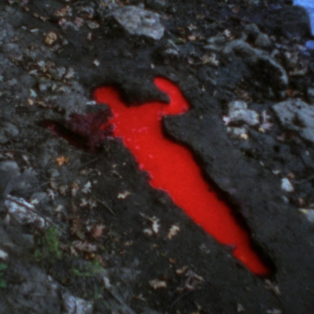
The fact that much of her work exists on film as a document of a fleeting moment is a testament to her interdisciplinarity. The Silueta (Silhouette) series (1973–80) is exemplary in this regard. An extensive collection of photographs and films, the work that constitutes the series is linked by variations on an image of a silhouetted female figure. The earliest iterations feature Mendieta, often nude in nature, but in Silueta Sangrienta (Bloody Silhouette) (1975) she appeared, nude or otherwise, for the last time. In the final shot of the two-minute film, Mendieta lies face down in a body-shaped reservoir that is filled with a vibrant substance analogous to blood. There are many ways to read this moment. One might see within it violence or suffering. One might spot an act of healing. Or, one might simply call it a mystery.
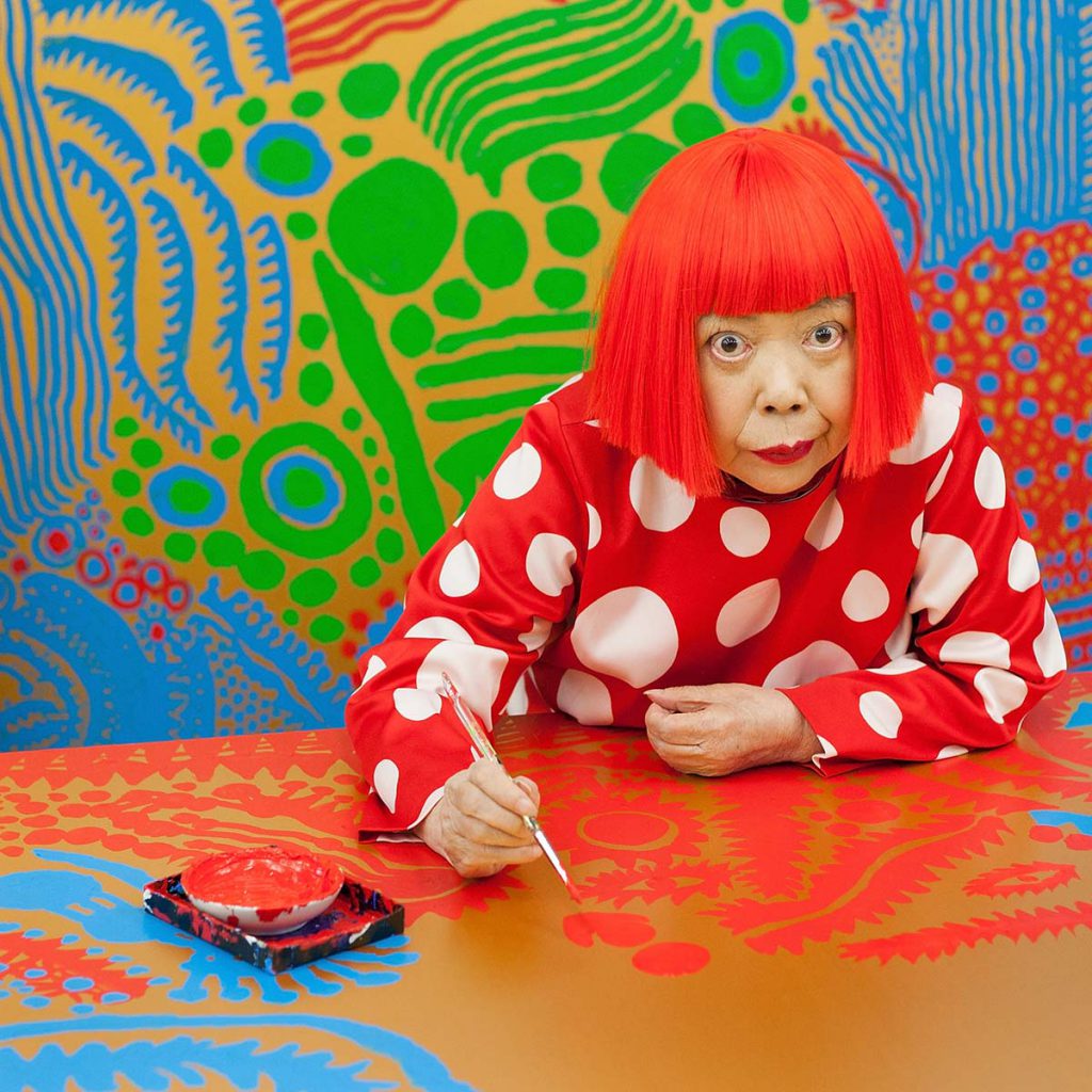
YAYOI KUSAMA: HER DOTS, AND HER RED WIG
Before Instagram made the Queen of Dots a ubiquitous presence on social media, Yayoi Kusama was a near-mythological figure. For decades she operated on the fringes of the art world while living at a psychiatric hospital in Tokyo, where she had admitted herself in 1977 after experiencing personal tragedy. This quiet life was a far cry from the wildness of her earlier days when she was an active participant of the 1960s New York avant-garde. In addition to her paintings and installations of that era,
she would host naked happenings and naked political protests during which she would paint the participants’ bodies in her signature style. But she never stopped working, despite her seclusion, and eventually the tides turned. In 1993 she represented Japan in the Venice Biennale, and in 2012 she was honored with a retrospective at the Tate Modern. That same year she launched a fashion collection with Louis Vuitton, featuring polka dots, of course. As for her personal fashion, she makes her own clothes, and she is immediately recognizable for her ever-present, bright red wig. Not all dots are drawn the same, and they snapped the stencil when they made Yayoi Kusama.
MARK ROTHKO: LIGHT RED OVER BLACK (1957) AND RED ON MAROON (1958)
One would hardly know that Mark Rothko sought to address the major philosophical issues of his time from the titles of his paintings alone. For example, Light Red Over Black offers little more than a general description of a 1957 piece. Red on Maroon, the title for a 1958 painting, is also banal. But Rothko was a serious man with a probing mind — the nature of spirituality in modern times was one theme that drove his creative explorations.
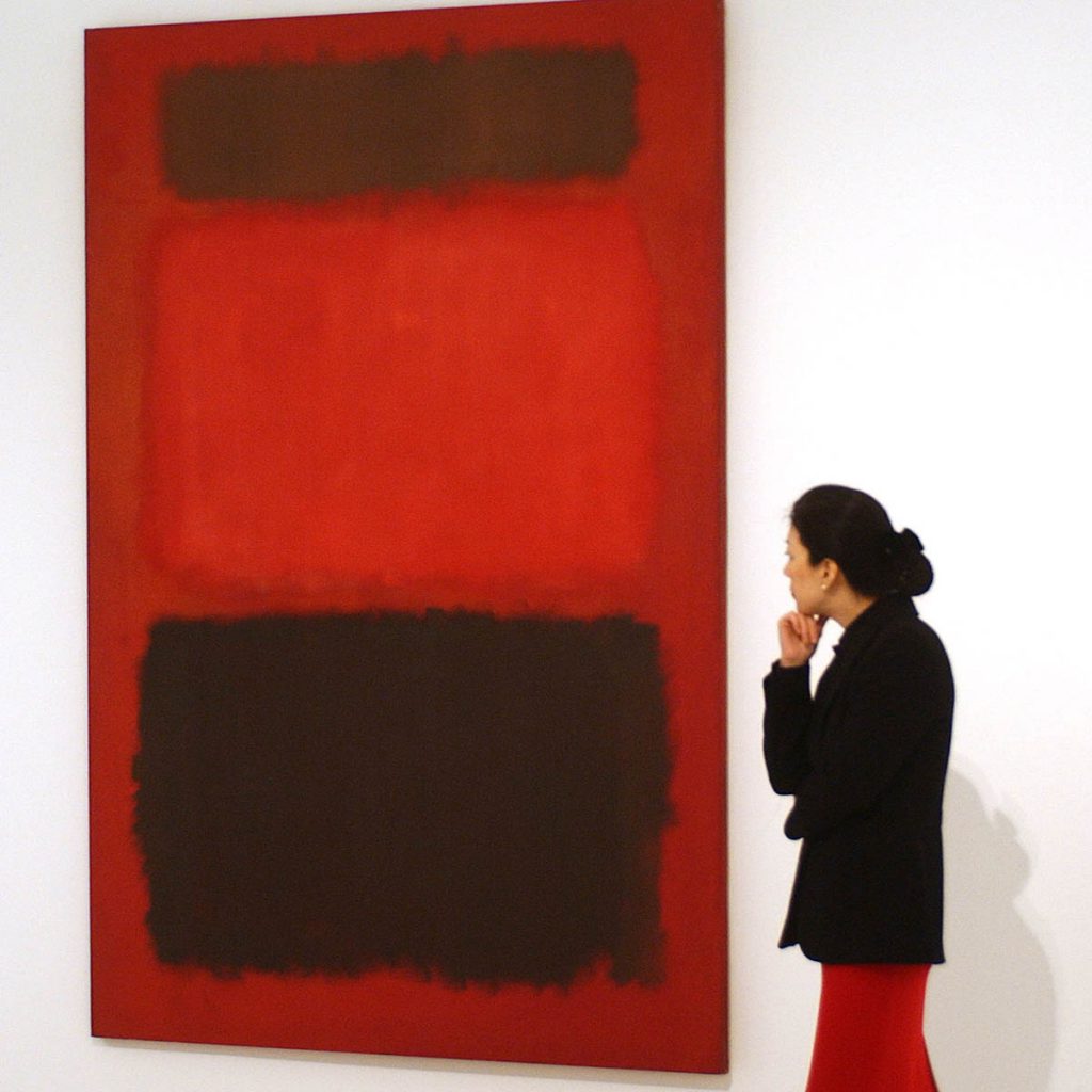
For decades prior to the color field paintings that are his claim to fame, Rothko worked in various modes inspired by mythology, psychology, and a healthy dose of Nietzsche. His paintings in the early 1940s looked distinctly Surrealist, but by the end of the decade, hazy rectangles became the vehicle for all of his biggest ideas. His rectangular compositions awakened spiritual states. The images are deceptively simple, but their technical execution is highly sophisticated. A buildup of many subtle layers creates a sense of space within the canvases, where the colored blocks appear to hover, advance, or recede within the dimensions of their picture plane. Given such optical dynamism, the title Light Red Over Black acquires new meaning: the entity that is light red is suspended over the vastness that is black; and Red on Maroon is appropriate for an image that defies normal perception. It expresses an uncanny energy, much like the phrase “the roof is on fire.”
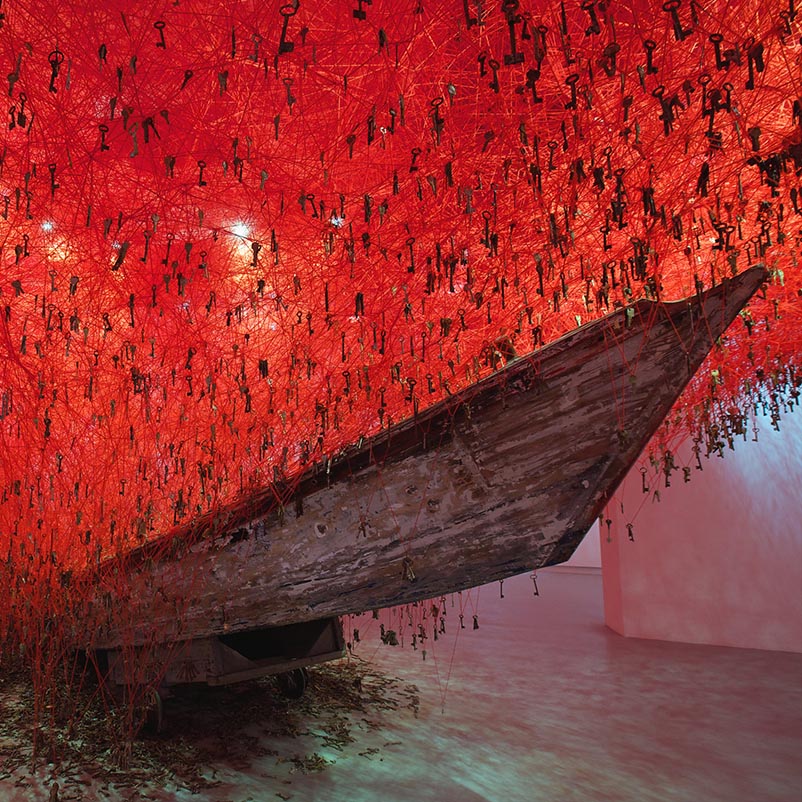
CHIHARU SHIOTA:
THE KEY IN THE HAND (2015), UNCERTAIN JOURNEY (2016/2019), AND DRIFTING (2019)

Chiharu Shiota is a master of the symbolic network; everything in her artwork is itself and something else. The boats, keys, and string in her watershed installation The Key in the Hand (2015), which she created for the Japanese Pavilion at the 56th Venice Biennale, represent open hands, ample opportunities, and the interconnectedness of existence, respectively. 


In other works, the boats double as a metaphor for the journey of life, and the string, especially when red, becomes a neurological map or, more abstractly, the web of fate. Her recent projects, such as Uncertain Journey (shown at Blain | Southern, Berlin in 2016 and again as part of her solo exhibition The Soul Trembles at the Mori Art Museum, Tokyo in 2019) and Drifting (presented in Line of Thought at the Museum Sinclair-Haus, Bad Homburg, Germany in 2019), up the ante on how much elaboration these motifs can withstand, as whole environments are built out of taut and tangled yarn that seems to explode within the gallery. Shiota’s background in painting and performance art — she studied with Marina Abramović in the late 1990s — inform the spectacle, or what some call the theatricality, of her work, though the results are never melodramatic; rather, her visions are anchored by a clear understanding of what it means to be a person.

END OF STORY